Thinx Inc Website Redesign
Thinx Inc
Opportunity: Thinx (period underwear) enjoyed high brand recognition and growth, and the company wanted to launch a teen version of the period underwear. Unfortunately, Thinx’s sister brand, Speax (bladder leak underwear), was not growing at the same rate. The organizational goal was to create an overarching user experience that unified all three brands under the umbrella of Thinx Inc, allowing for a combined shopping cart and shared marketing opportunities, while at the same time maintaining each brand’s unique identity, user-specific flows, and product education.
Project Impact: The creation of Thinx Inc and the implementation of the tri-brand navigation encouraged traffic between brands and cross-brand shopping:
Speax drove 11.99% traffic to Thinx and 3.47% to BTWN
Thinx (BTWN) drove 25.37% traffic to Thinx and 7.94% to Speax
Thinx drove 3.45% traffic to Speax and 3.80% to BTWN
Two months post-launch the total revenue increase was +$1,024,950.00 across all 3 brands, with all brands contributing to this revenue uplift:
Speax: +15.9%
Thinx: +14.7%
Thinx (BTWN): +27.1%
Speax CVR: 4.32% (+105.7% uplift) | Thinx (BTWN) CVR: 5.52% | Thinx CVR: 2.92%
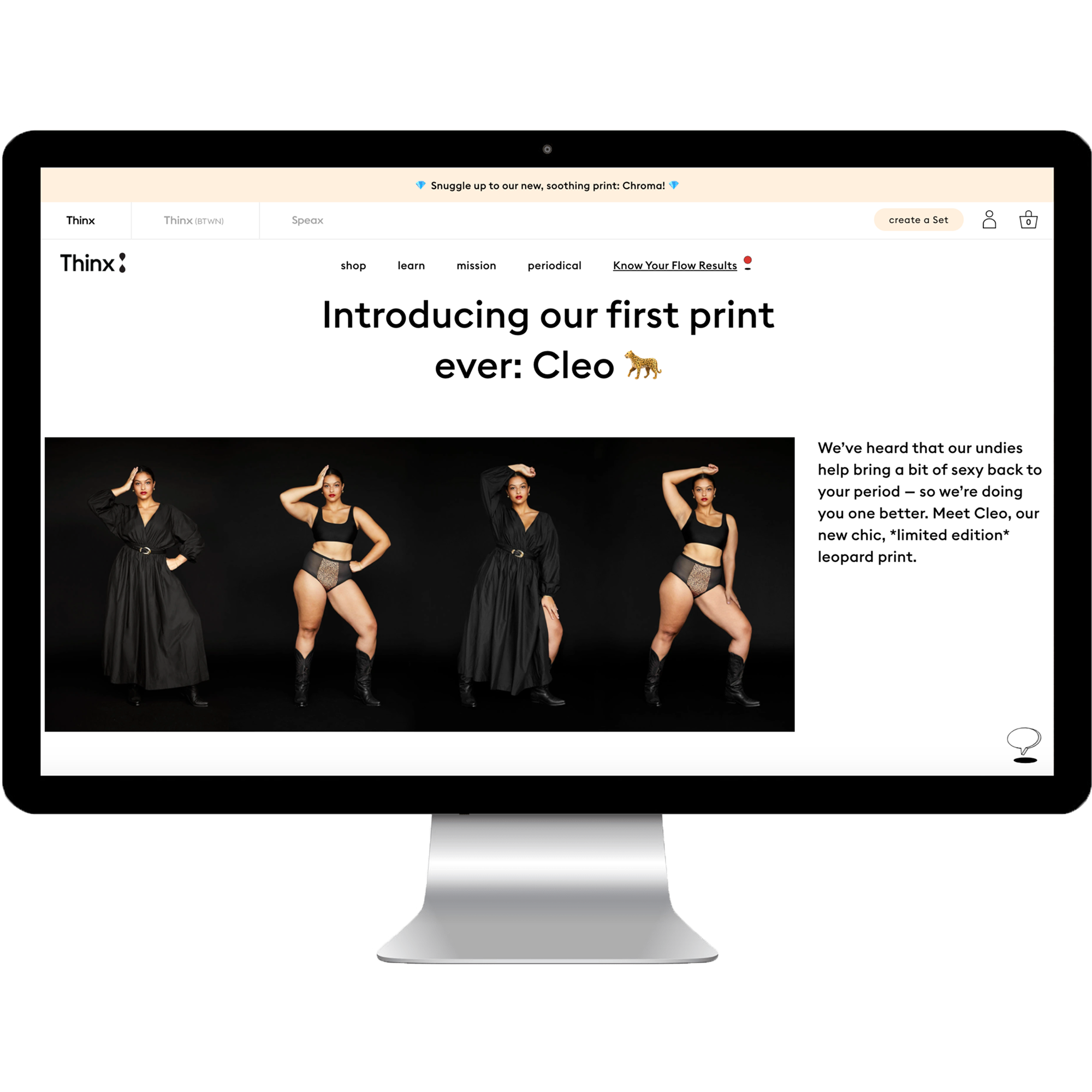
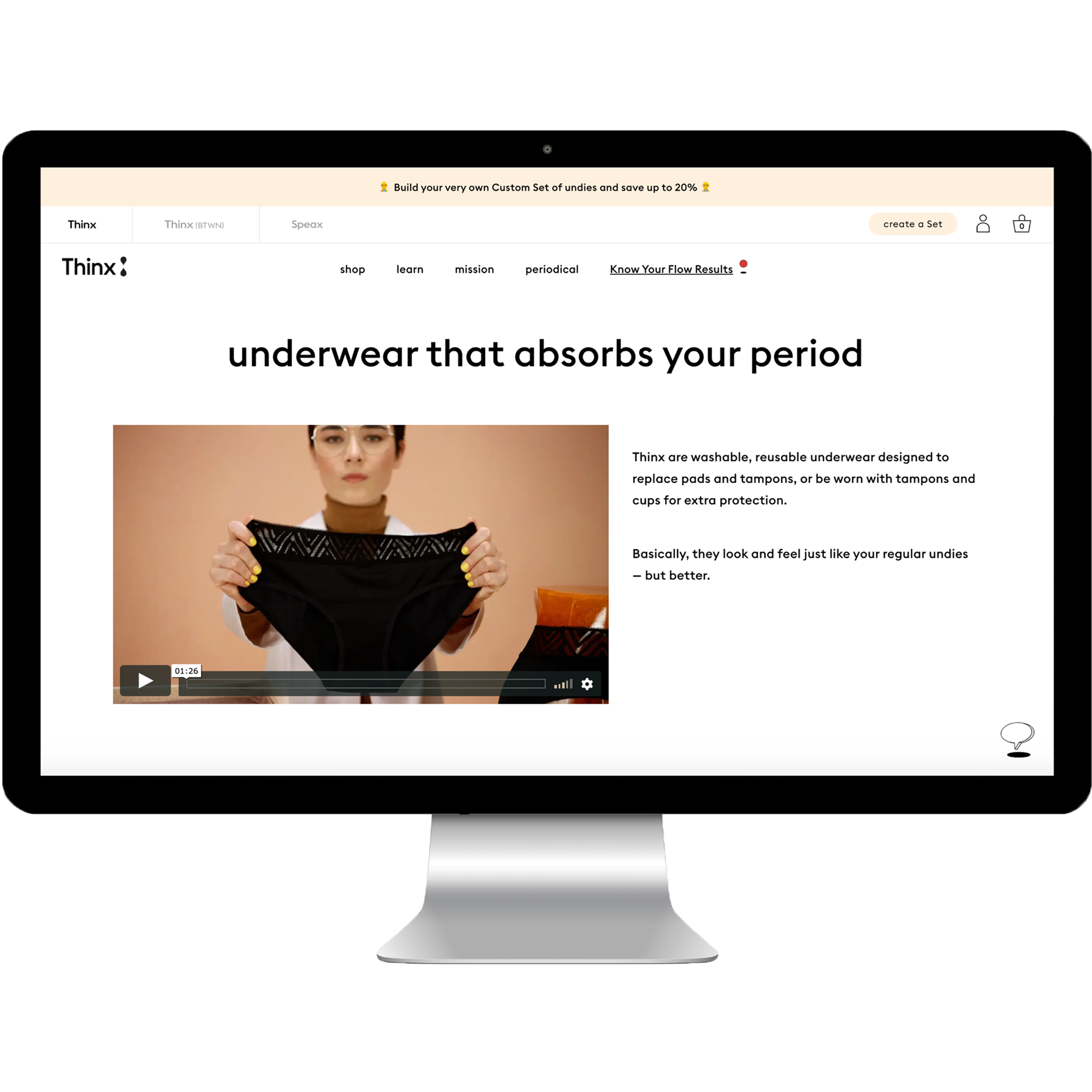
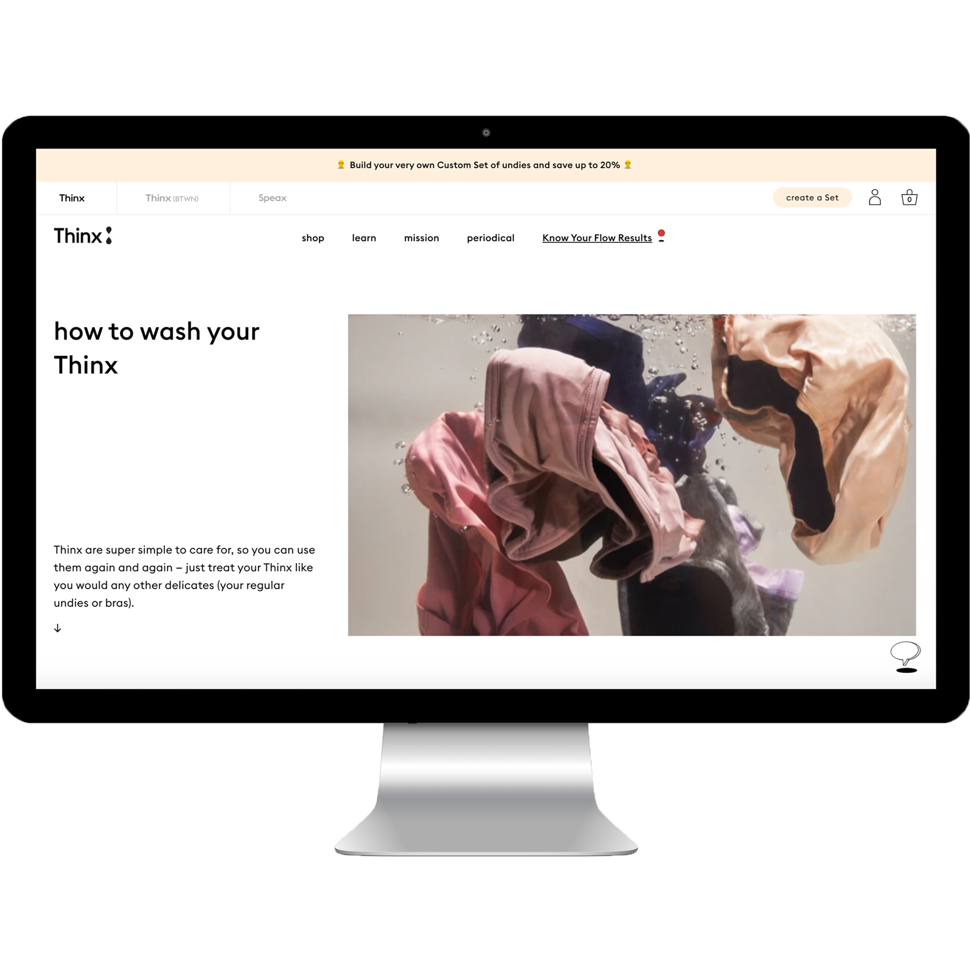
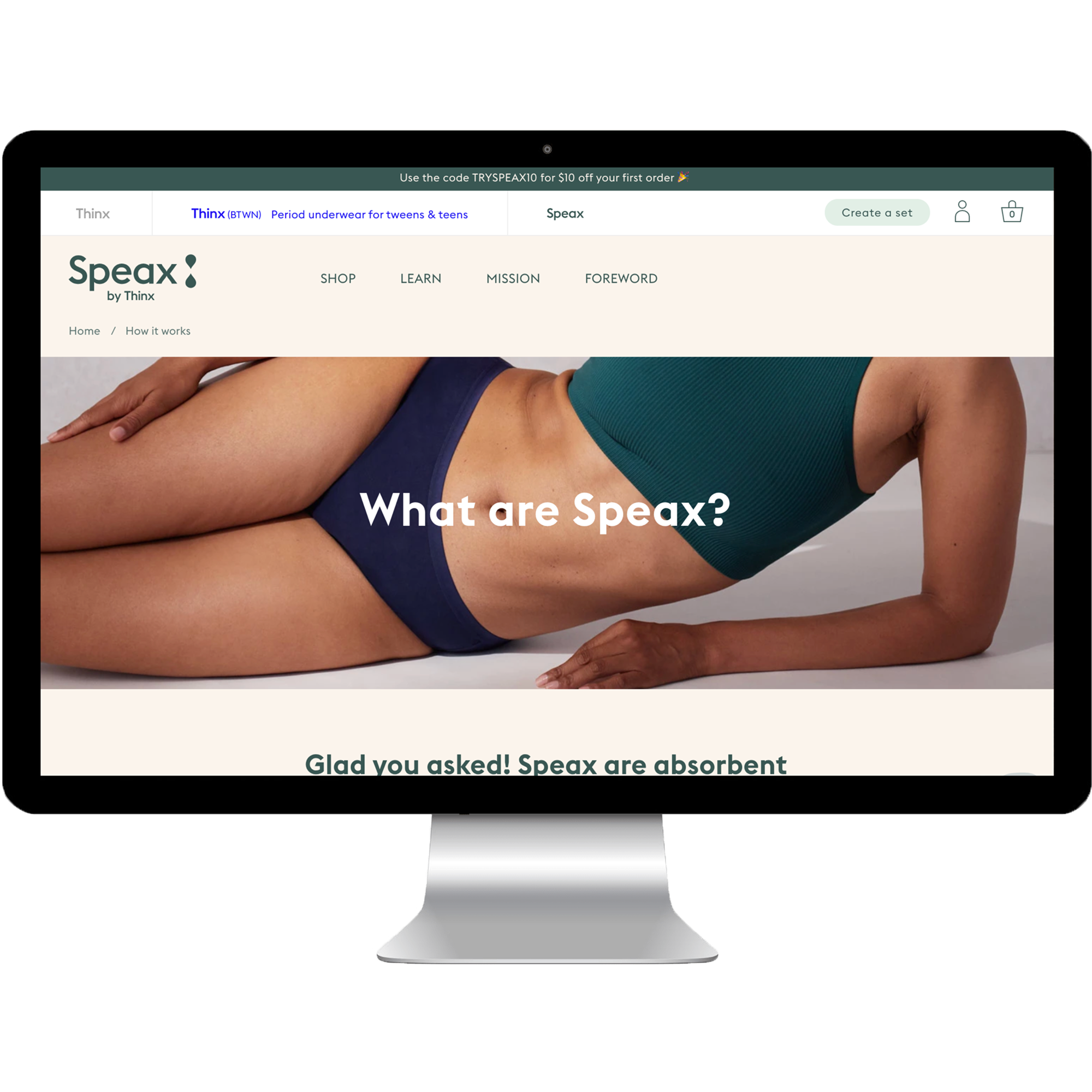
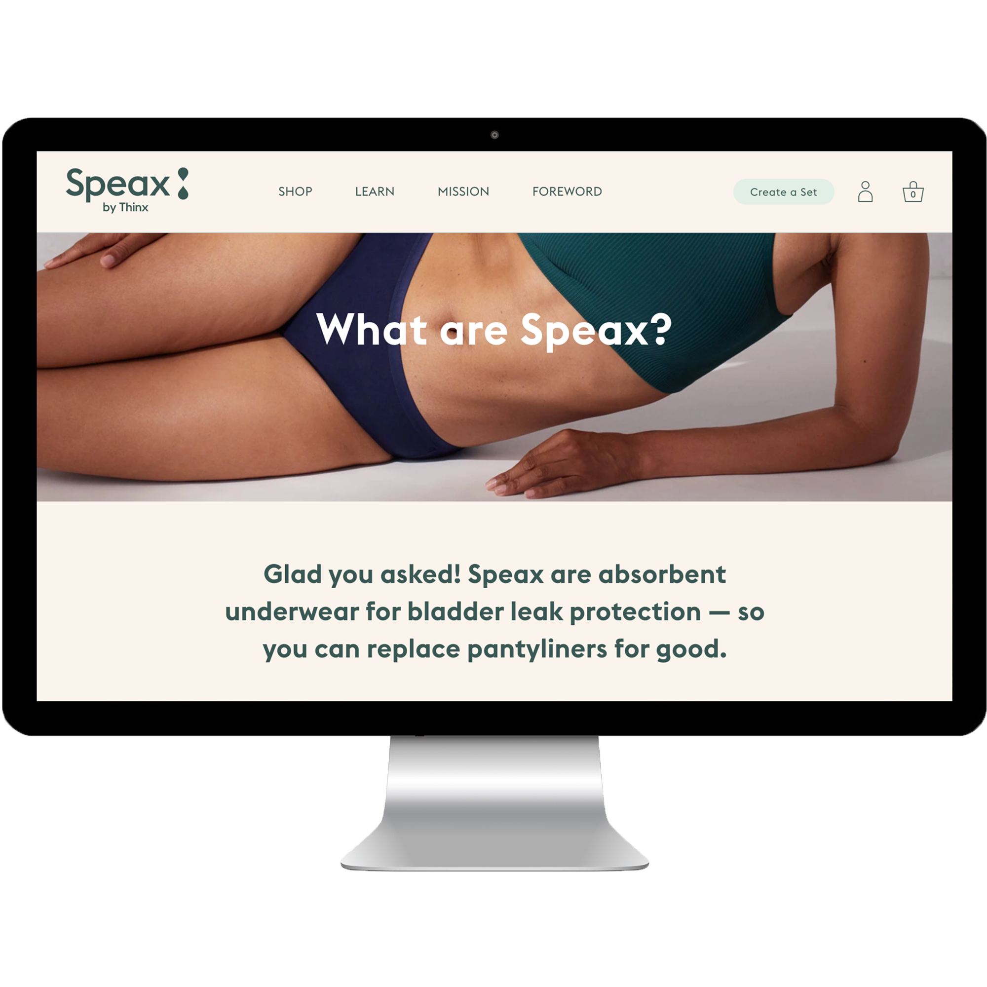
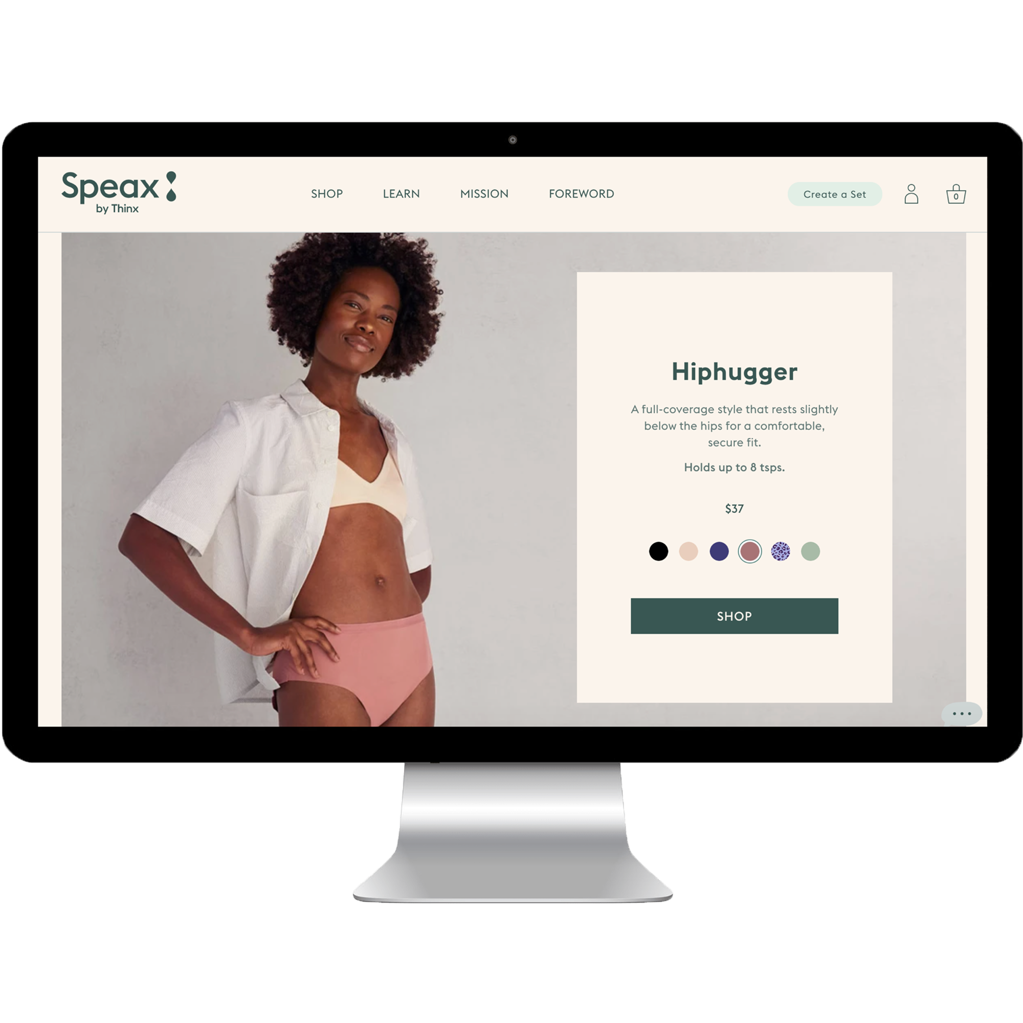
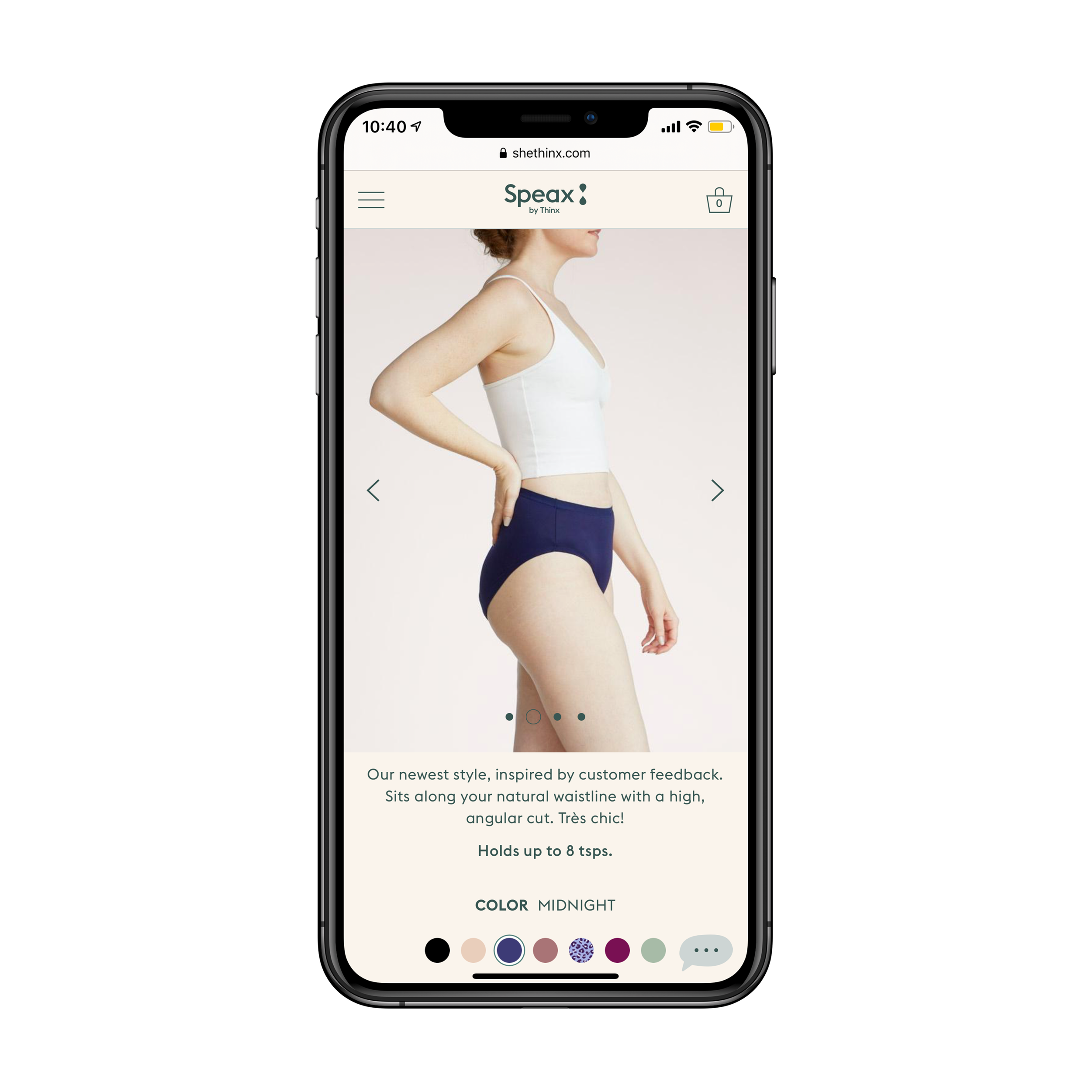
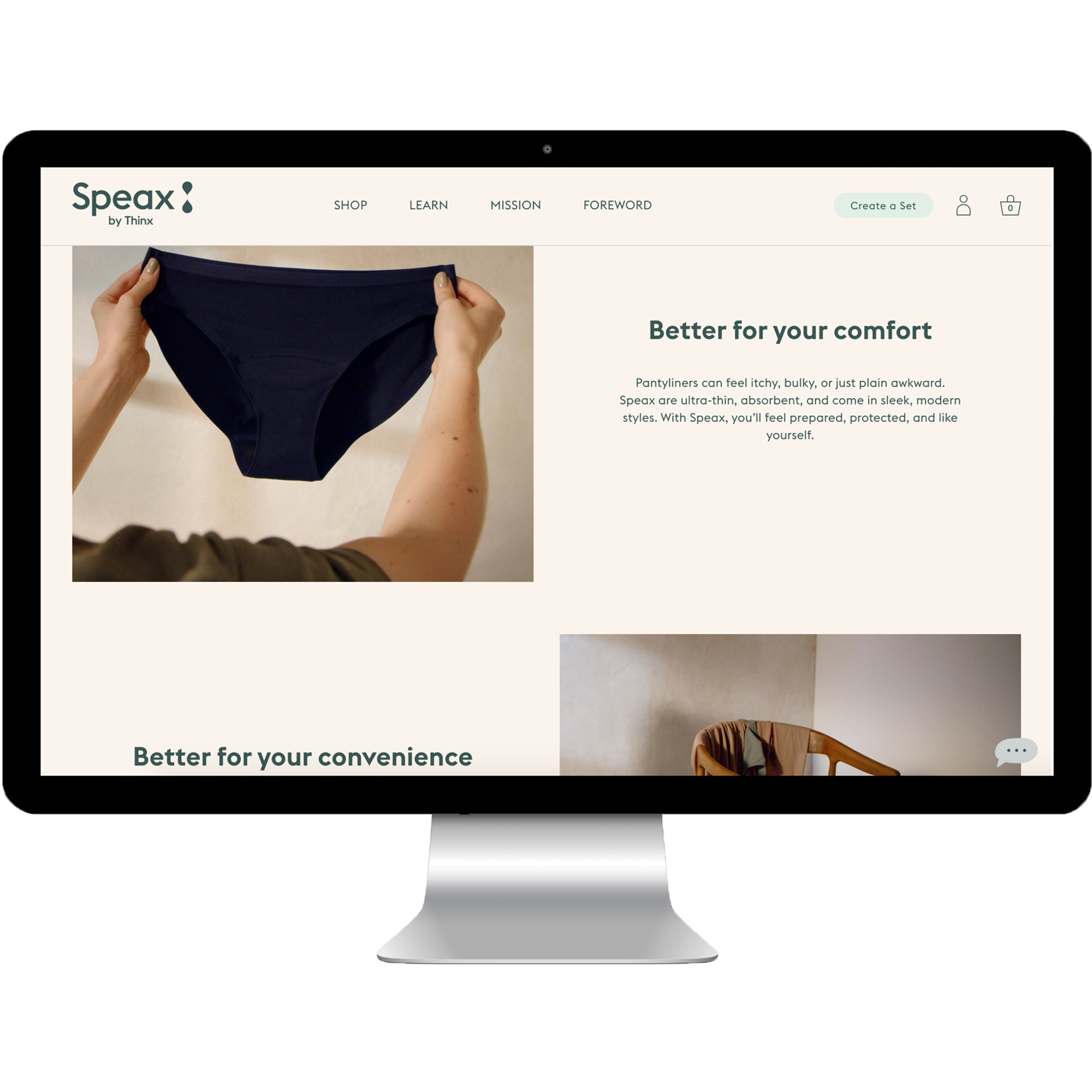
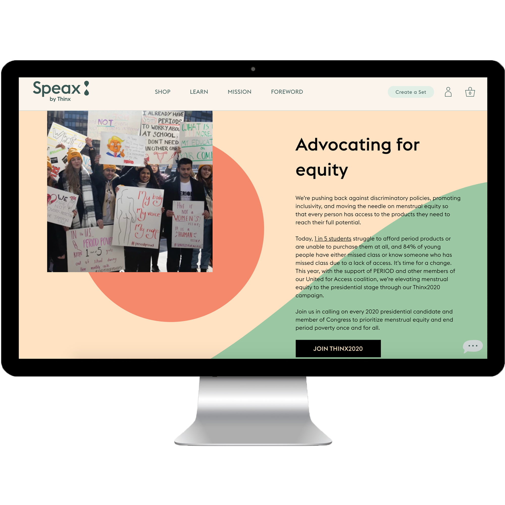
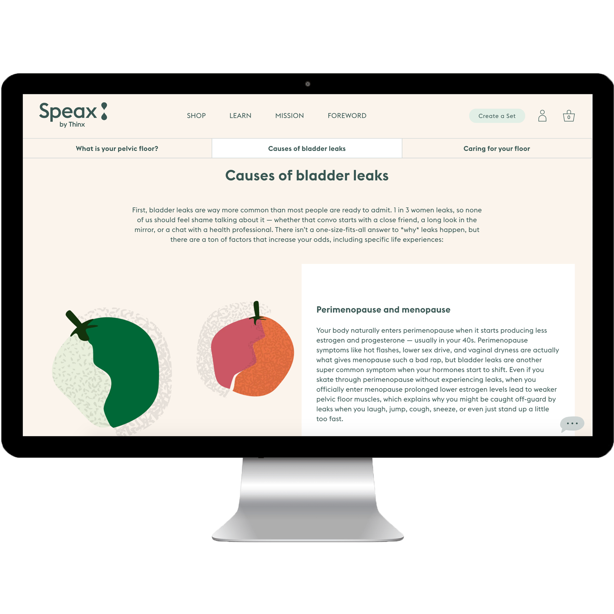
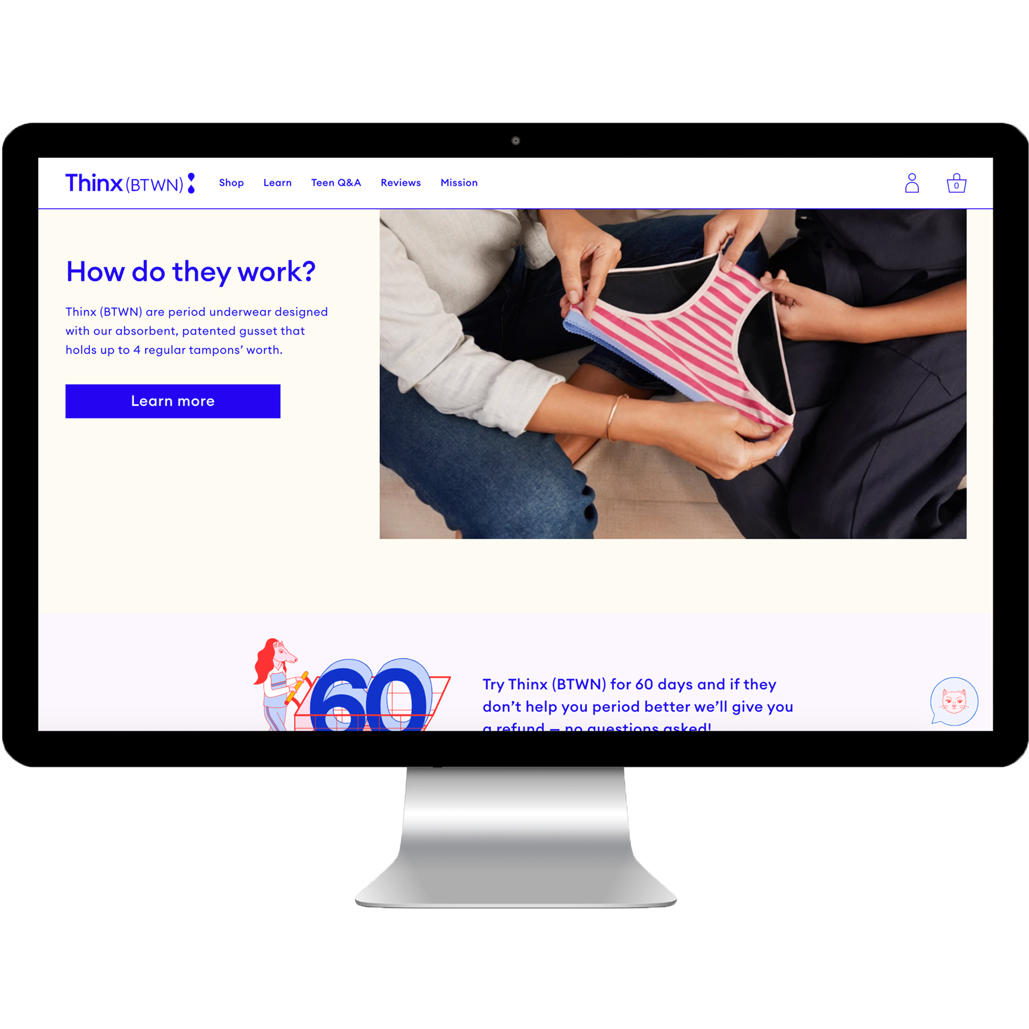
Thinx Inc was a multi-year design project which included the complete rebrand of Thinx (period underwear) and Speax (bladder leak underwear) websites, the creation of Thinx (BTWN) website (teen period underwear), and the unification of all 3 brands under the umbrella of Thinx Inc. By unifying Speax and BTWN with the stronger brand recognition of Thinx, the goal was to see a positive brand halo effect, as well as create a platform of commerce, content, and community for women aged 8 until the end of life. Additionally, this project resulted in the creation of web-style guides and component-based design systems that scale responsively and ensure designs are accessible, user-centered, and consistent.
My Role: UX & Product Strategy Lead, Research and Design Lead, Project Manager
Team: Brendan Hastings (VP Digital Product), Meng Shui (Creative Director), Michelle Flacks (UX Designer), Jenny Liu (UX Designer), Genna Schwartz (Visual Designer), Kim Suchy (Visual Designer), Elise Mortensen (UX Researcher), Andrew Puig (Developer), Lawrence Stiers (Developer)
project highlights
Thinx Inc Strategy: Brand Unification
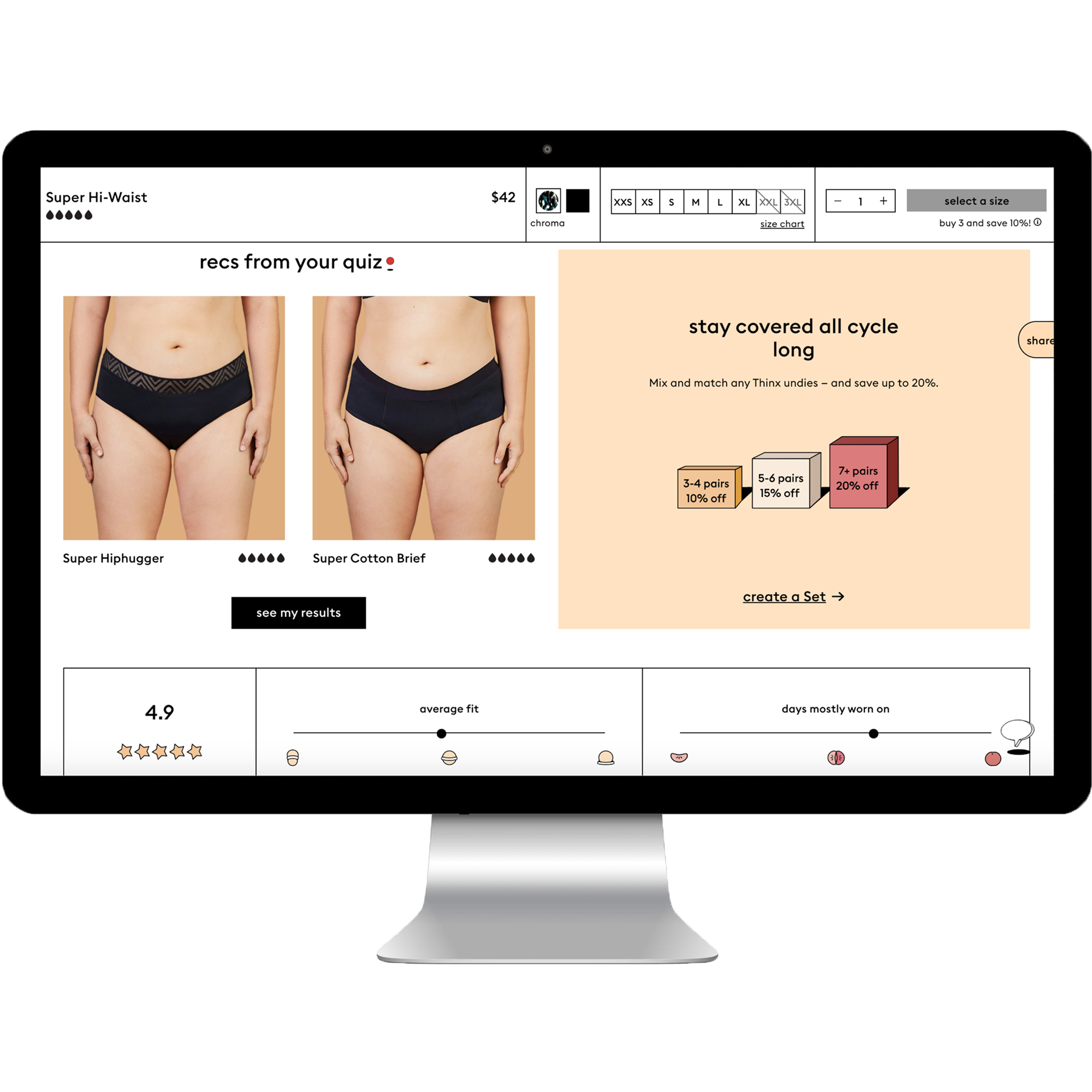
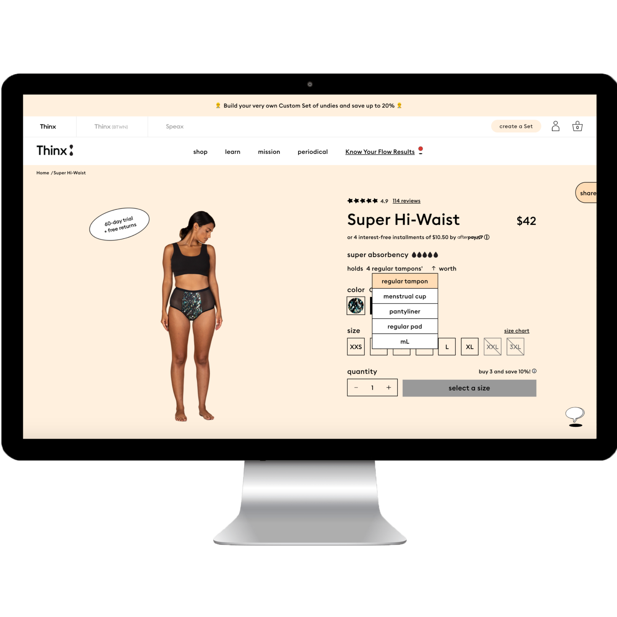
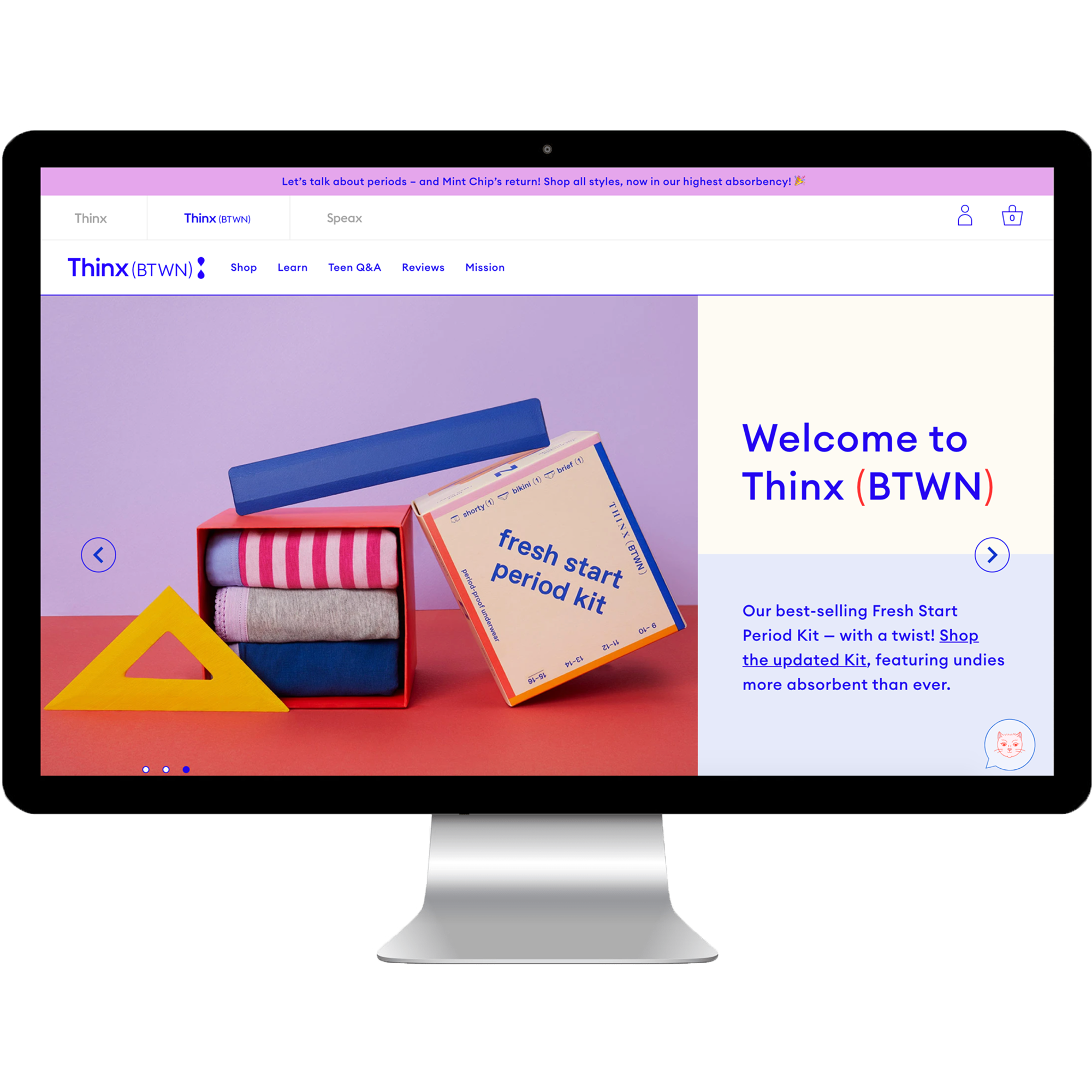
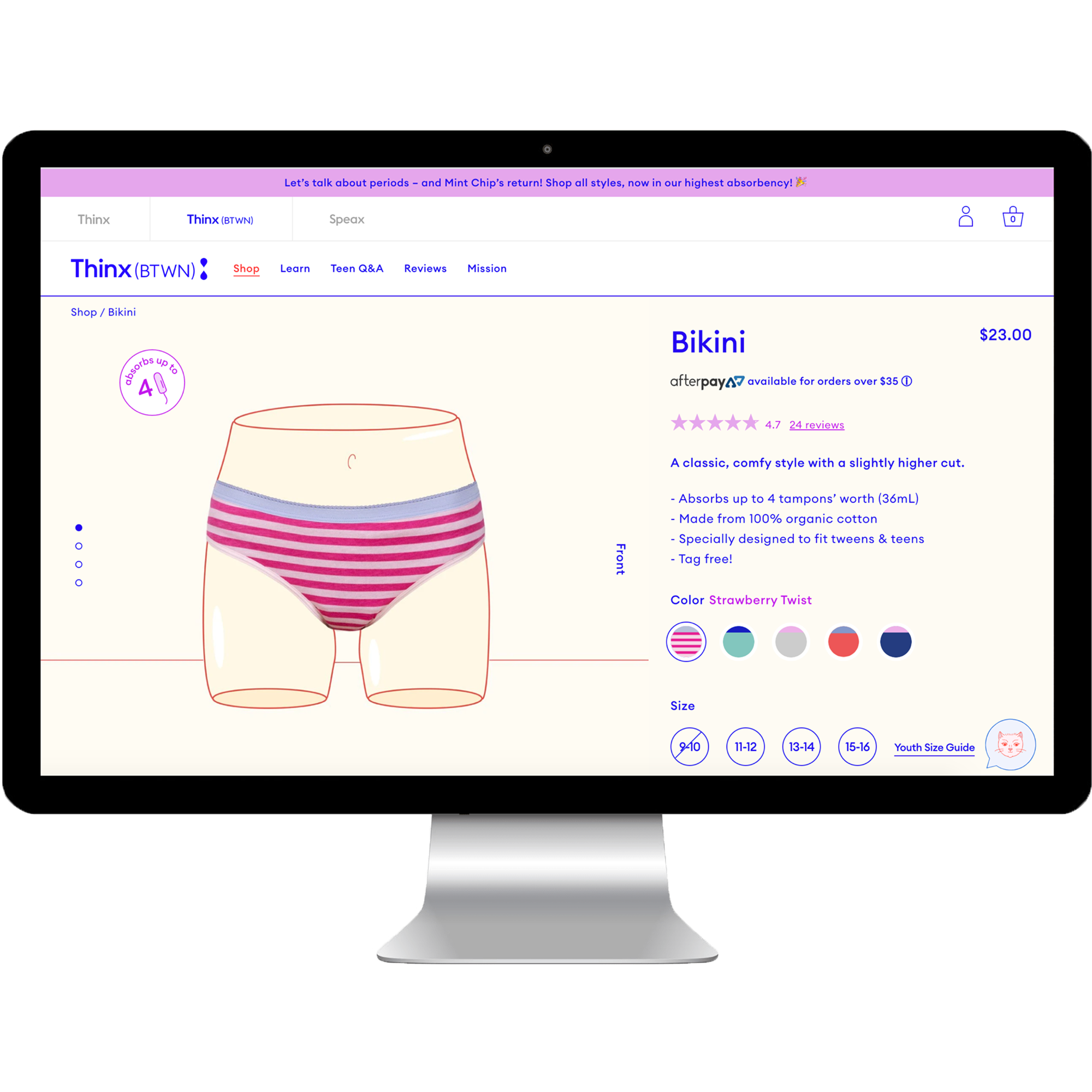
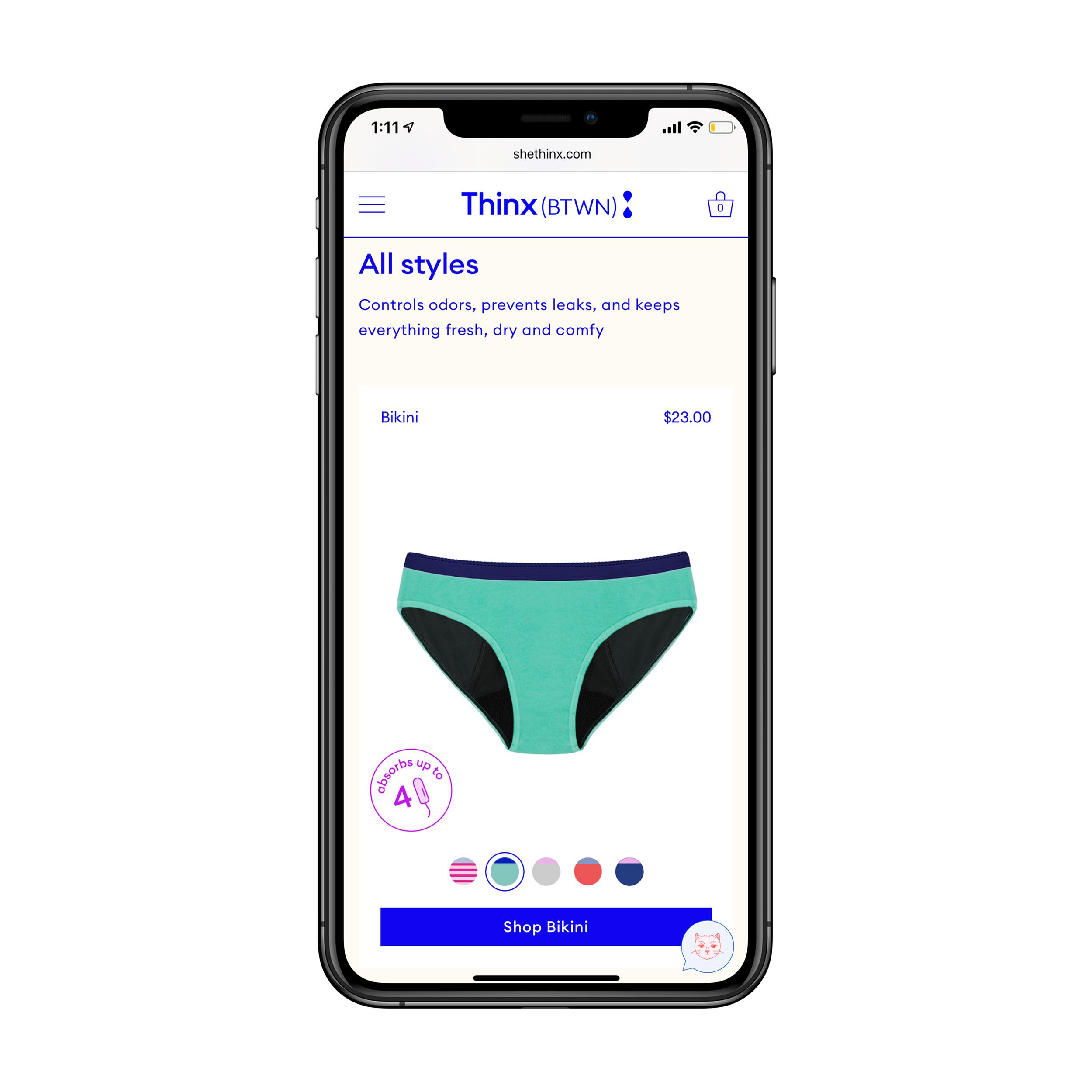
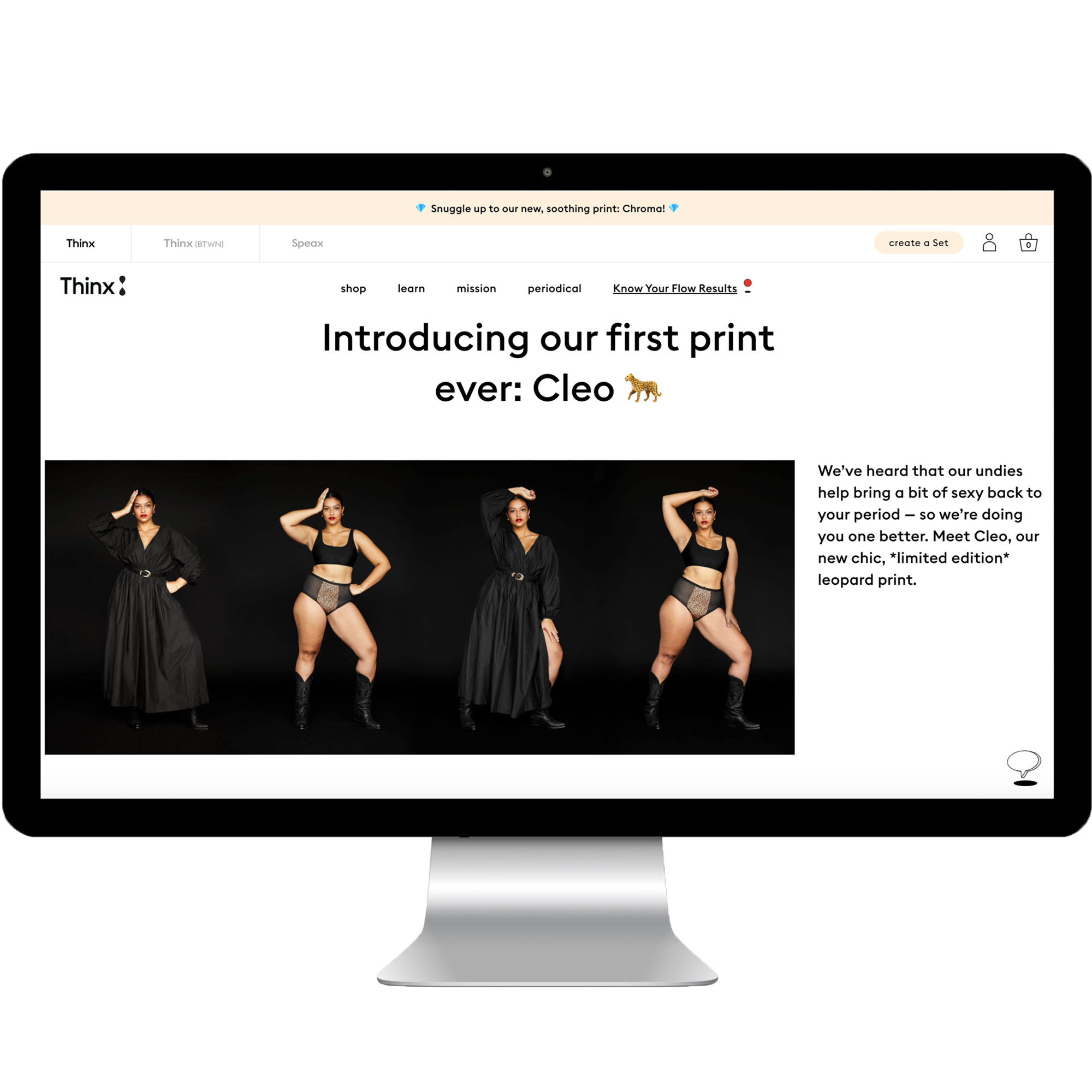
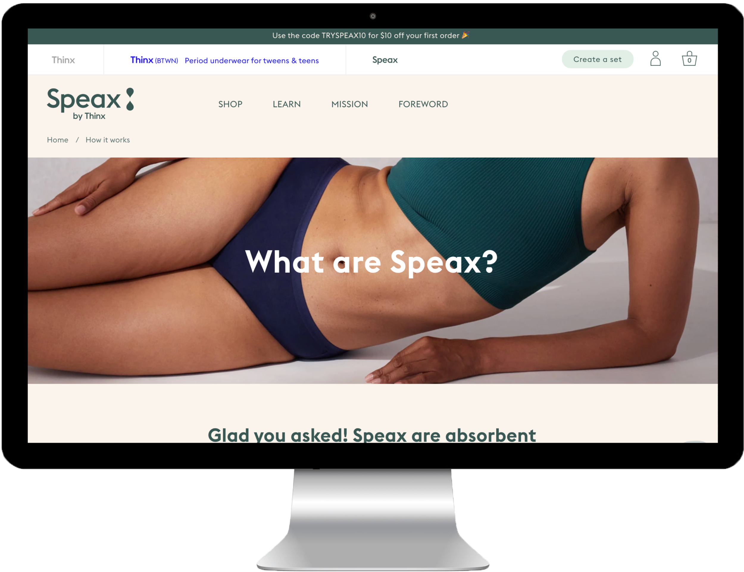
An important objective of unifying the three brands was increasing brand discovery. This was accomplished by implementing an interactive tri-brand navigation above each brand’s individual navigation. This feature allows users to navigate easily between all three brands and provides brand education by exposing each brand’s value proposition on hover. When reviewing the site analytics of mixed-brand carts, we saw users navigating between brands using the tri-brand navigation. Additionally, the element tested well with users: “They’re trying to reach different generations of women. They’re about taking care of women.” The successful integration of the brand experiences also allowed our marketing efforts for one brand to have a positive impact on the other brands, saving the company resources and money.
Thinx Inc Strategy: Account and Cart
Another important feature of brand unification was that the three brands would all share one cart and one account for the first time. To communicate this to users we again utilized interaction within the tri-brand navigation. When a page loads, the tri-brand navigation, containing the ‘account’ and 'cart' icons, loads above the brand-specific navigation. As the user scrolls down on the page, the ‘account’ and ‘cart’ icons slide down to fit into the brand-specific navigation and remains sticky until the user navigates to another page or scrolls back to the top of the page. At that point the tri-brand navigation returns and the 'account' and 'cart' icons slide up into it. Additionally we were able to utilize the cart and account as educational touch points, encouraging users to check out the other brands.
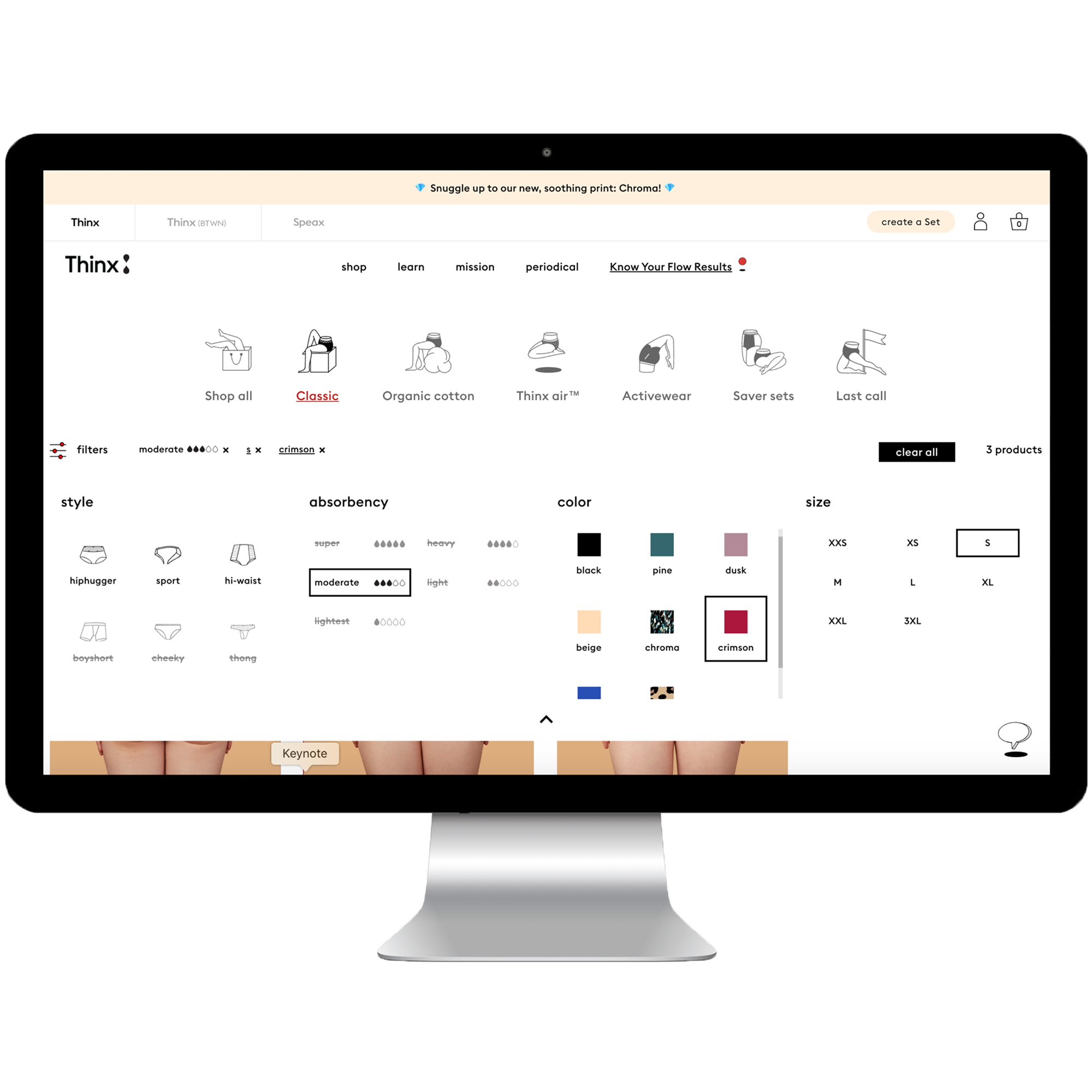
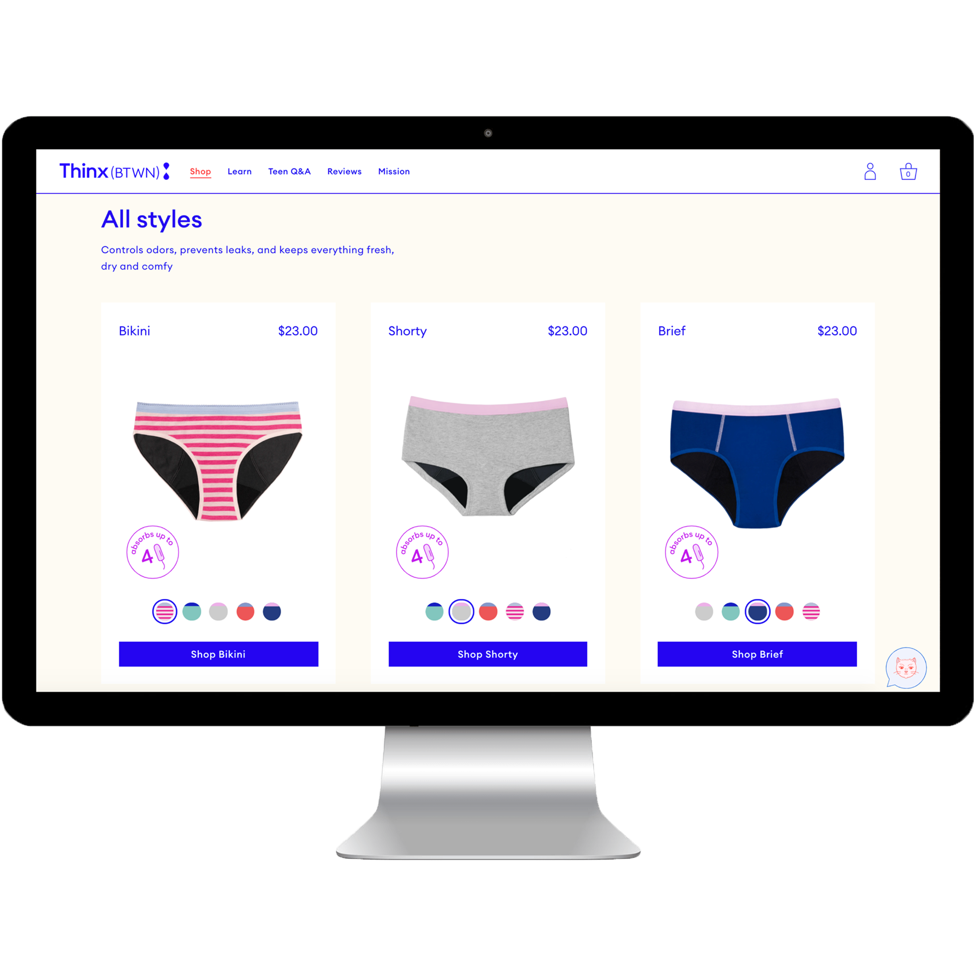
Component-Based Design Systems and Headless Development
When I first joined Thinx as the first UX hire, the Creative team only had print designers and all website designs were handed off to the Dev team as desktop-only PDF designs. An important part of this redesign was to create a component-based, user-centered design system for each brand, as well as work in lock-step with the development team to create a shared language and build parity between the design and development environments. This close collaboration led to three interconnected design systems (1 per brand) that were pixel-perfect, responsive across breakpoints, future-proofed, and efficient for continuing to scale the brands.
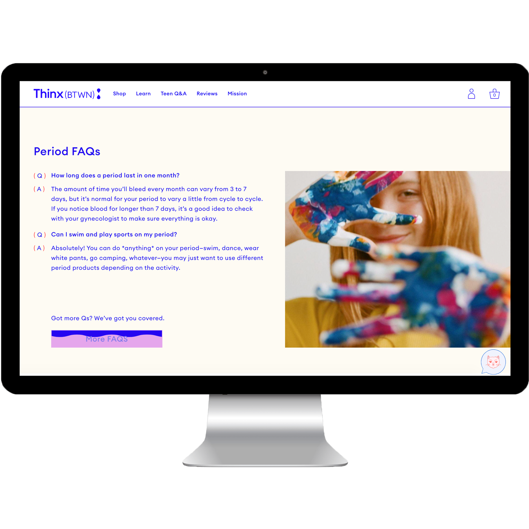
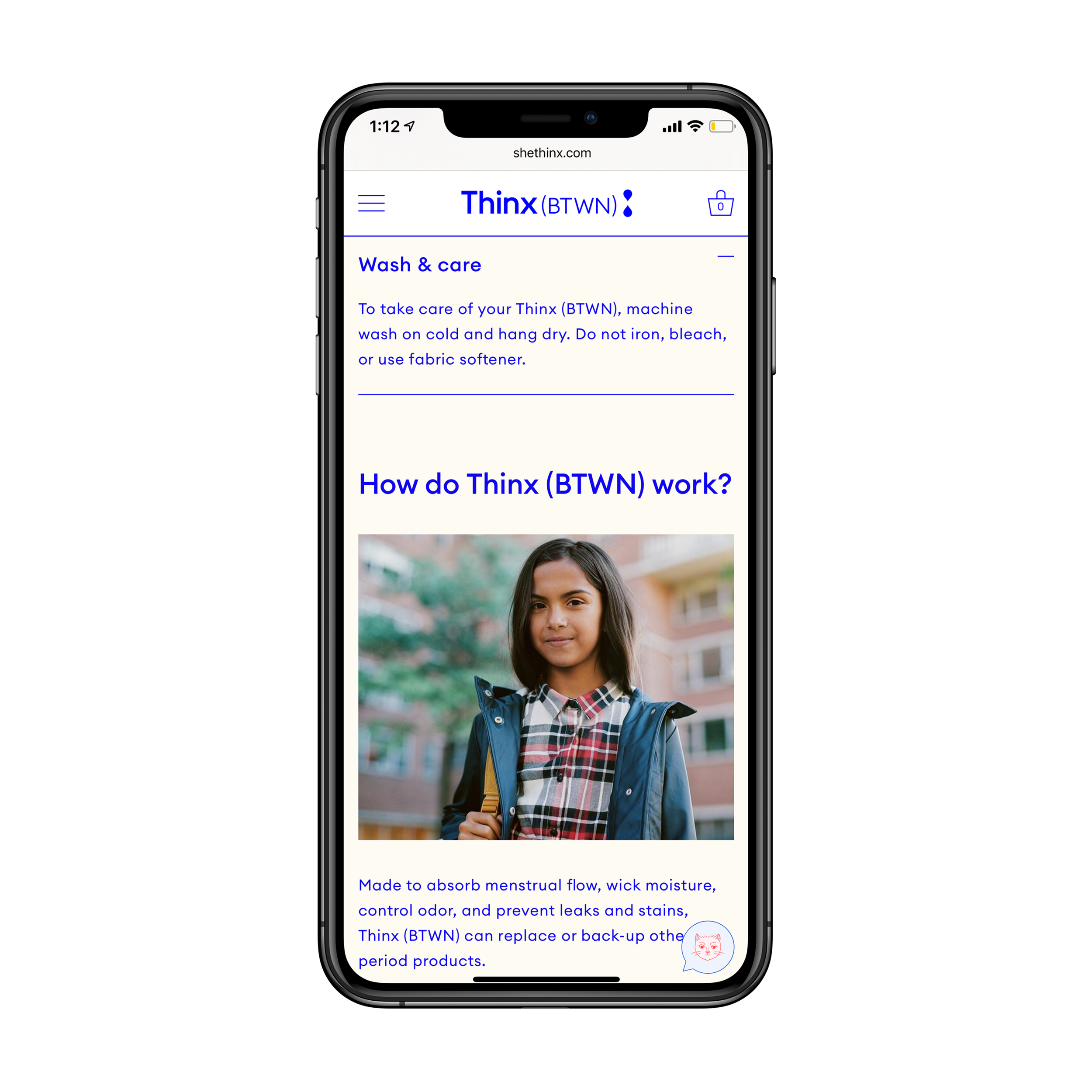
User Research and Product Education
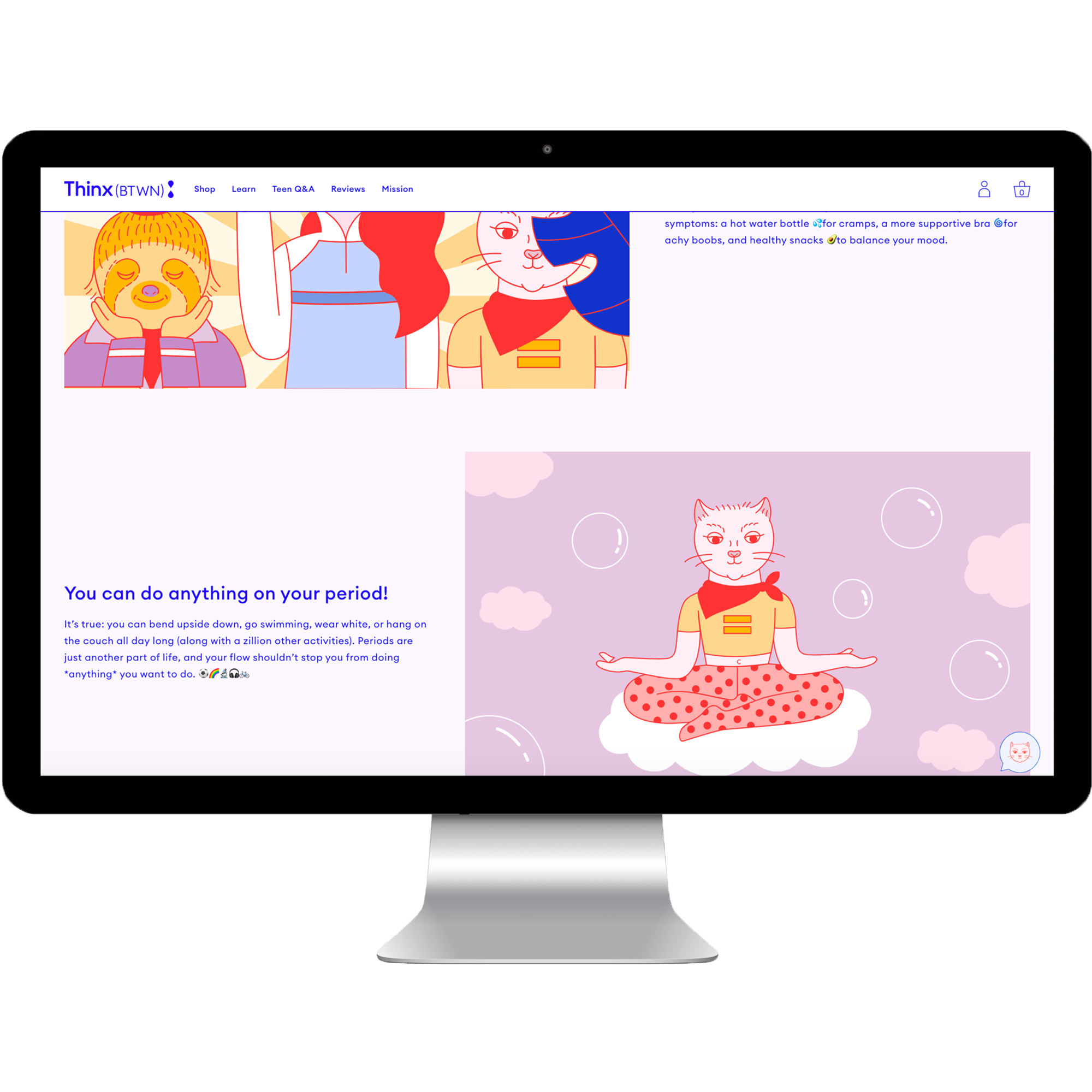
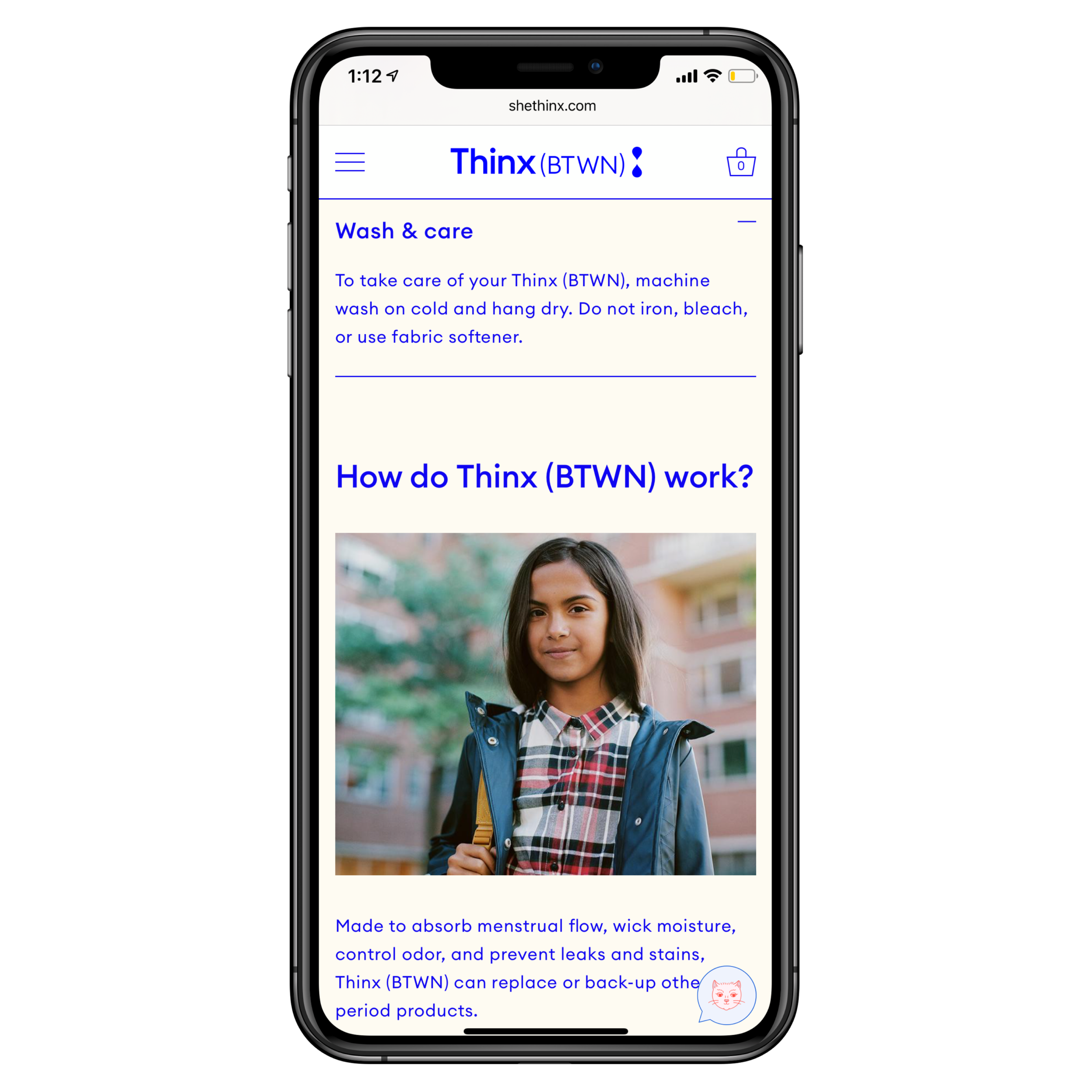
Extensive user testing was conducted throughout the Thinx Inc redesign. Each brand has a specific user group (including senior users), unique barriers to purchase, and different product use cases. We evaluated the initial tri-brand website designs, new creative directions, and product education user journeys in focus groups conducted in Dallas, Kansas City, New York City, and Los Angeles. Additional focus groups were conducted for Thinx (BTWN) in Houston and New York City with young girls (ages 10-16) and parents of pre-teens. There had been relatively little research done prior to the decision to launch a teen line and the UX Team became integral in leading the exploratory user research that would define the digital strategy.
Additionally, IA testing (tree tests and card sorts), analytics, and quarterly usability testing was conducted to first guide and then evaluate the decisions and direction. Finally, before kicking off the Thinx redesign, the UX Team hosted collaborative persona and user journey workshops to organize our findings and create the site structure and idealized user flows.